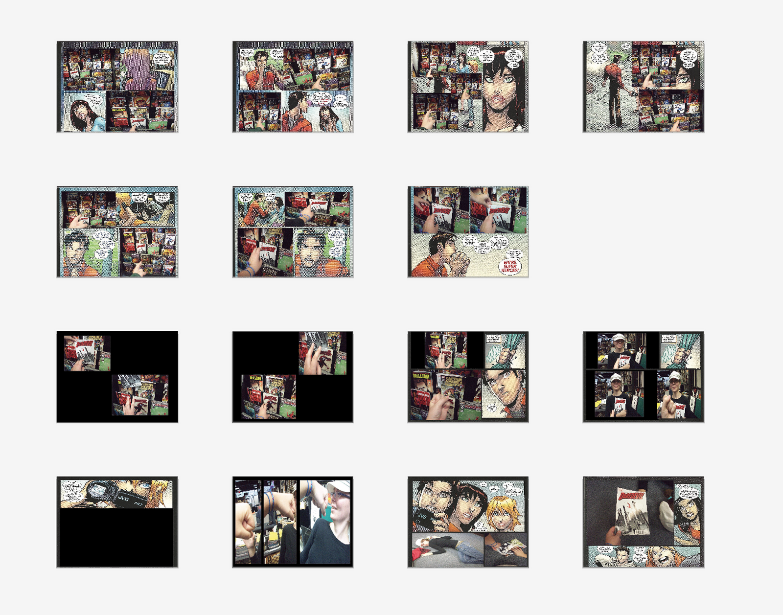
Here is the link to my Project 3: An Experience Video that's been redone. It's based on me going to get a Comic Book from the 21st Century comic book store. It represents whats kind of going on in my head when I'm doing something like getting a comic. The Characters are from The Amazing Spiderman the Spider Island issue 668 and the audio is the Marvel logo intro.
http://vimeo.com/33550278
Spiderman and the marvel logo audio are trademarks of Marvel. I do not own them
Monday, December 12, 2011
Wednesday, November 16, 2011
Project Three: An Experience Video
Here is the link to my Project 3: An Experience Video. It's based on me going to get a Comic Book from the 21st Century comic book store. It represents whats kind of going on in my head when I'm doing something like getting a comic. The Characters are from The Amazing Spiderman the Spider Island issue 668 and the audio is the Marvel logo intro.
http://vimeo.com/32184872
Spiderman and the marvel logo audio are trademarks of Marvel. I do not own them
http://vimeo.com/32184872
Spiderman and the marvel logo audio are trademarks of Marvel. I do not own them
Tuesday, November 8, 2011

Monday, October 31, 2011
Project 3 Experiences: storyboard one
Here a rough and I mean rough idea for my storyboard I haven't add any of my own text and I don't have notes yet cuz I really have no clue of how to approach this piece. Comments are heavily appreciated.
 sorry if its hard to see I had to do a screen shot.
Monday, October 24, 2011


Wednesday, October 12, 2011
Project 2 Animated Dictionary: Final Video
Here is my final video for this project.
http://vimeo.com/30464879
Reflection:
This project was confusing at first and at times I wanted to throw Flash out the window. But the over all process was good. If I had to redo I might slow it down a lot and choose a different color scheme. I think this project has helped in understanding how storyboards help in organizing a piece and how much of a pain Flash can be.
Project 3: An Experience: list of Experiences
Here is my list of experiences that happen most of the time; often; and rarely.
most of the time/often:
1) wake up and snooze alarm
2) get ready for class (brush hair/teeth)
3) wait for bus
4) eat (lunch/dinner)
5) go to Sparty's
6) go to anime club
Rarely:
1) go to Comic book store
2) Draw
We also had to pick an example of design that is a good combining of type and image. I chose this piece from the AIGA website
http://designarchives.aiga.org/#/entries/Image%20/_/detail/relevance/asc/447/7/19755/water-h2o--life/1
This piece is called Water: H2O = Life
Designed by: Elizabeth Anderson, Kelvin Chiang, Aaron Shoon (senior designers), Brandon Huang, and Dan Ownbey.
Design firm: American Museum of Natural History
Reason for it:
It examines water’s importance to humans, animals and the environment, problems of having too little and too much, how we are changing it, and how we can help solve some of the problems we have created. The graphic-design challenge was to unify a diverse series of exhibits, from a full-size polar bear to an entire wall of bottled water. The show was an opportunity to explore translucency and depth; the graphics print directly to Plexiglas in several layers of transparency. The graphic panels are organized in horizontal bands around the (generally circular) spaces; while the spaces themselves reference individual drops, the bands recall the horizon and the leveling quality of water.
I chose this piece because of how the WATER image with type looks it's very eye catching and I like how the water moves over the type.
I chose this piece because of how the WATER image with type looks it's very eye catching and I like how the water moves over the type.
Thursday, October 6, 2011
Flash Demo
This is my Flash Demo. The mask don't work like they're supposed to but we can't figure out why must be a hickup in the program enjoy ^_^
http://www.vimeo.com/30115247
http://www.vimeo.com/30115247
Monday, September 26, 2011

Wednesday, September 21, 2011

Wednesday, September 14, 2011
Project Two Animated Dictionary: Storyboards
Here are my storyboards for this project: The word is DIP
Storyboard One

Storyboard Two

Storyboard Three

Tuesday, September 13, 2011
Project Two Animated Dictionary: type in motion example
For Project two we take a word that is a contranym ( a word with multiple meanings that contradict each other) and make a video that uses only Typography to explain the two meanings of one word.
In my research I found this video "Size Matters Not"
The Type is used with a combination of Large and small text that builds on each other. It uses a lot of word sliding and zooming out like the words are being sucked into the background. The use of just the green and white color helps to sparate the words so they aren't blending together but also the two colors keep the piece from being too wild with color. The use of highlighting or adding effects to certain words brings attention to the meaning of whats being said and draws focus. The bold block text fits well with the Star Wars theme.
All the techniques do give me a good start to ideas of how to go about this project.
Project One Design Is...
For Project One we made a Stopmotion Video to the theme Design Is(...) my parent Erica Garcia and myself choose Challenges the Mind as our topic. We used magazine and newspaper clips to make our video the setting is the display case just outside the elevators on the ground floor of Kersge Art Center. This was challenging to put together in its own rights in what to use and how to set it up plus keeping the same frame for each picture a tripod is definitly a must for stopmotion.
Here's the link to the video on Vimeo:
http://www.vimeo.com/29018658
This video is the silent version
This video has a sound clip in it to make it more exciting
Here's the link to the video on Vimeo:
http://www.vimeo.com/29018658
This video is the silent version
Sound clip: theme song to Angry Birds copyright Rovio Mobile
Subscribe to:
Posts (Atom)